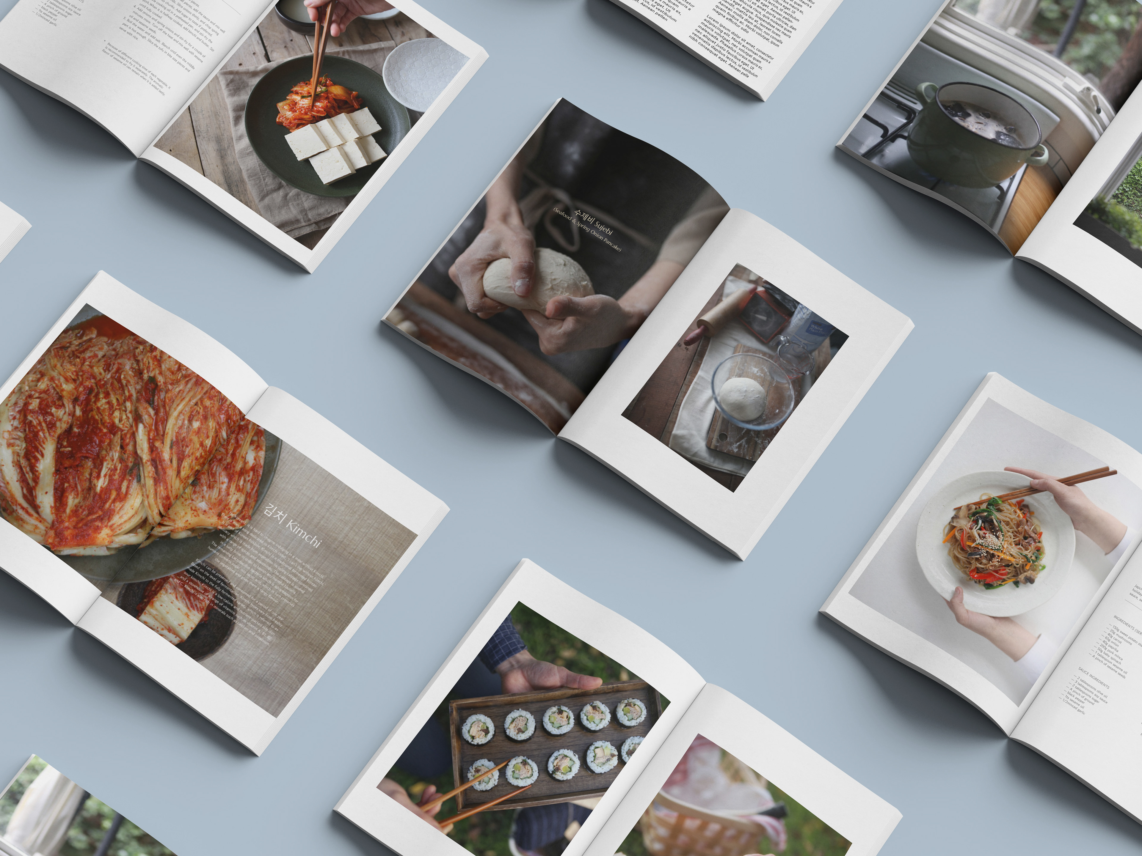
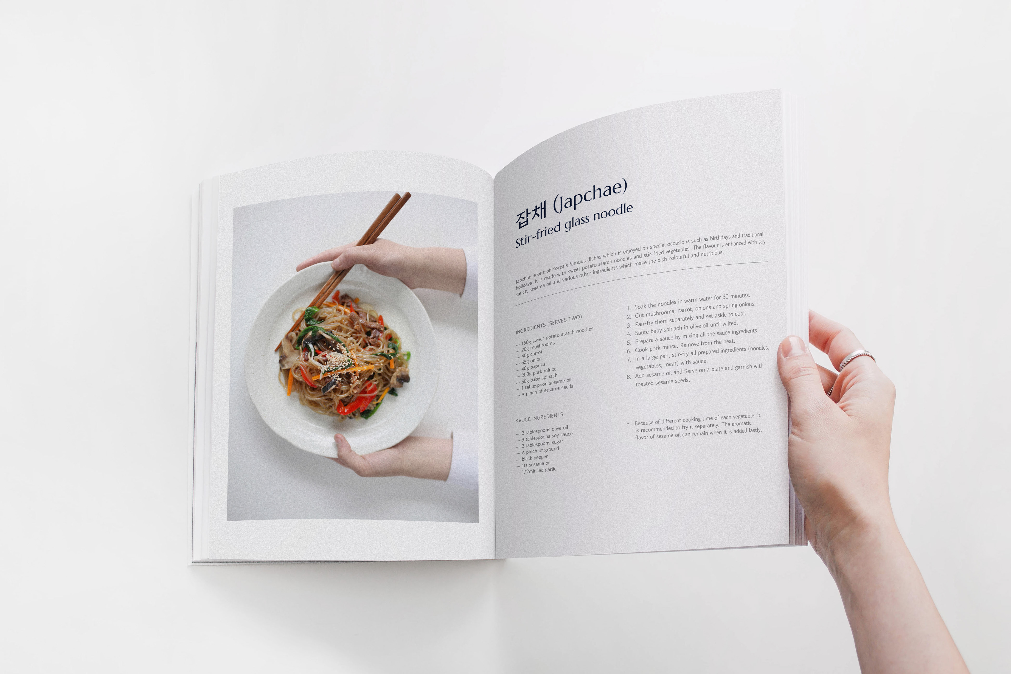
Dimi bang (디미방) is a Melbourne-based food research team of passionate Korean food lovers with the ultimate goal to globalize Korean food. I was asked to participate in this project and was in charge of creating the logo, illustrations, and editorial design of its cookbook, containing recipes and photographs put together by chef and photographer, Tae Hong Um.
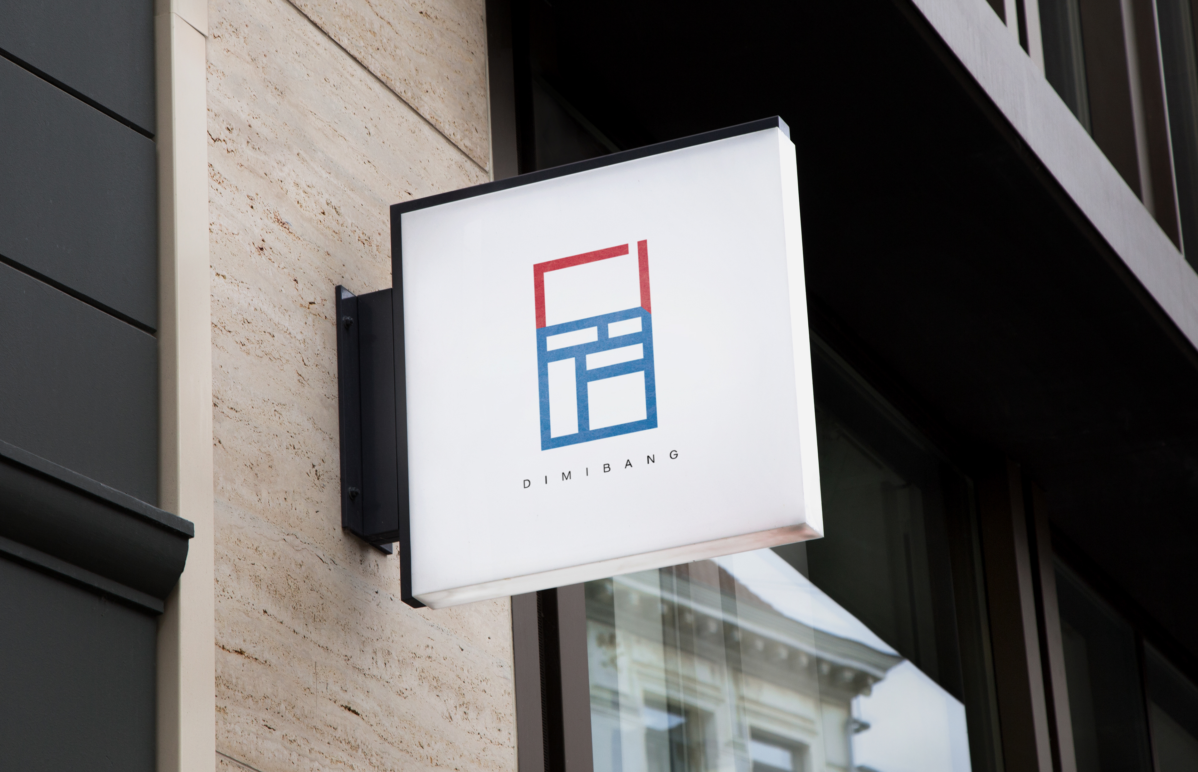
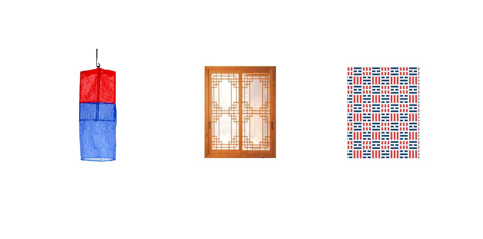
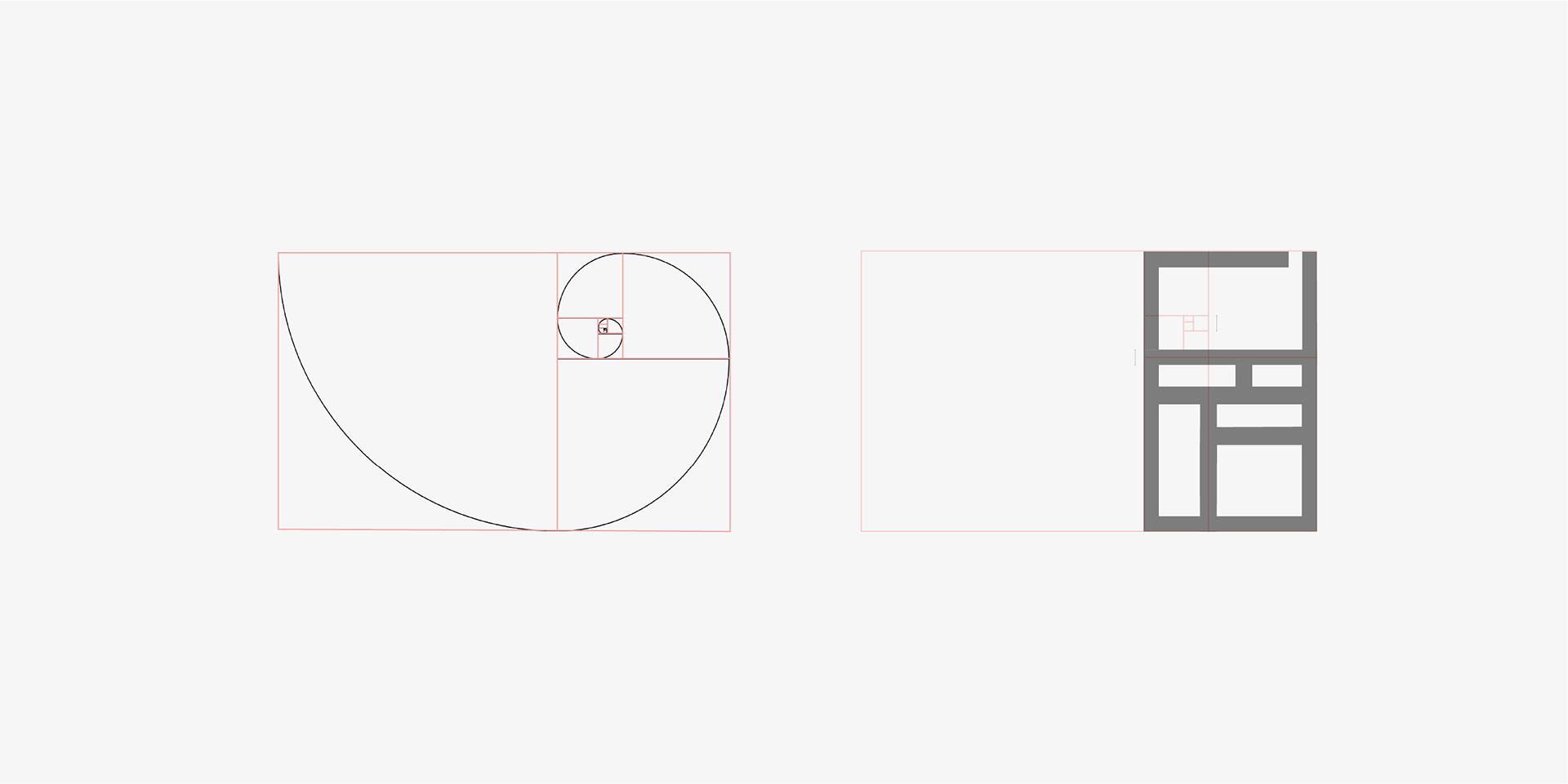
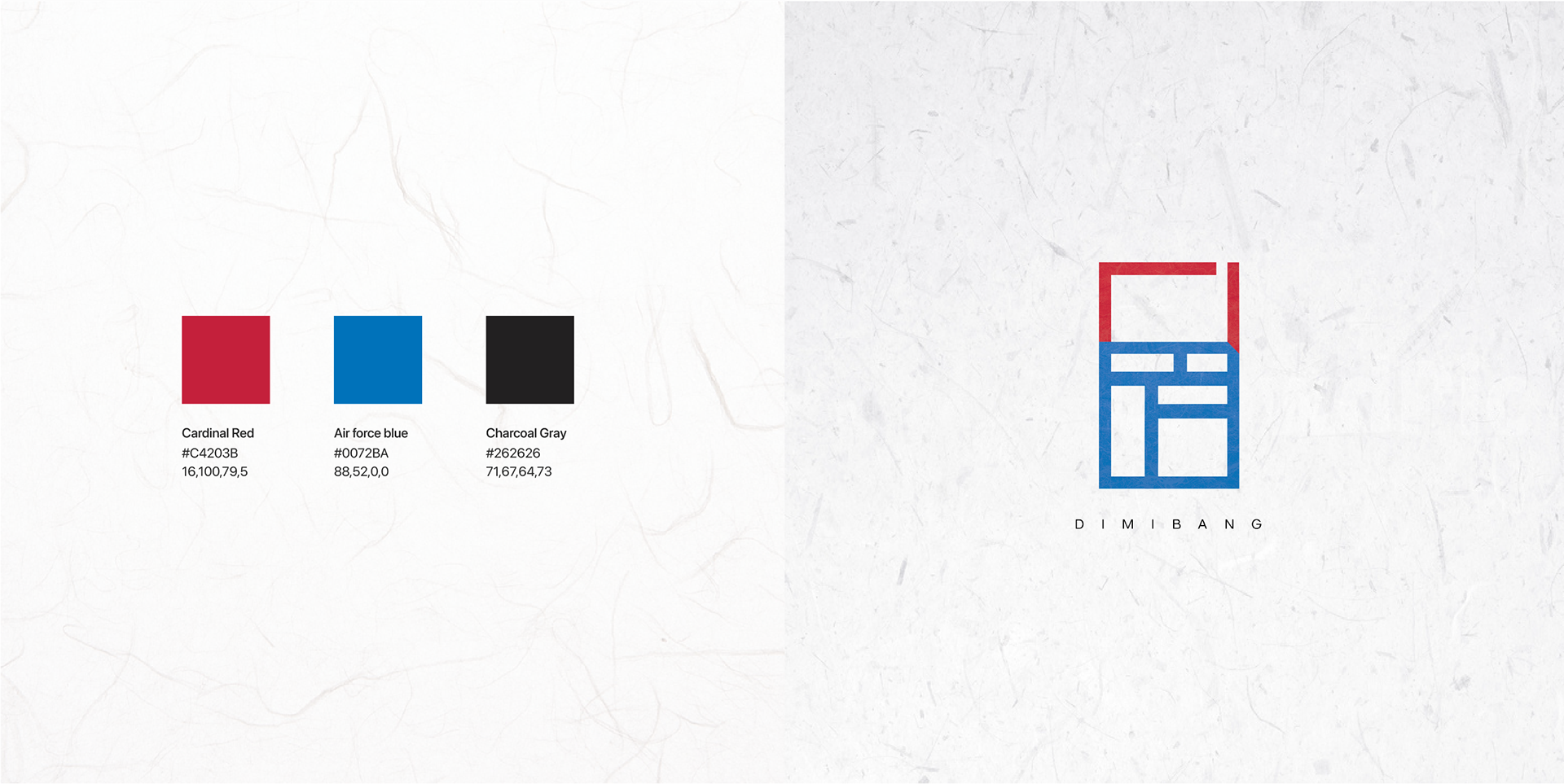
Chef Taehong proposed the idea of a logo depicting the Korean traditional lantern, Cheongsachorong, symbolizing 'shining light on Korean food and culture.' After several sketches, the most suitable and balanced logo was selected. I drew inspiration from Cheongsachorong and various Korean traditional patterns for the logo.
Red and blue, the main colors of the South Korean flag and Cheongsachorong, were incorporated into the design. Additionally, Korean hanji paper texture was applied to the main logo to embody Cheongsachorong."

Although Dimi Bang's cookbook features many traditional Korean dishes, we aimed to give it a modern touch while preserving the essence of traditional Korea. We used an English sans serif font paired with a Korean serif font for contrast, and incorporated minimal layouts with ample white space to achieve a contemporary aesthetic.
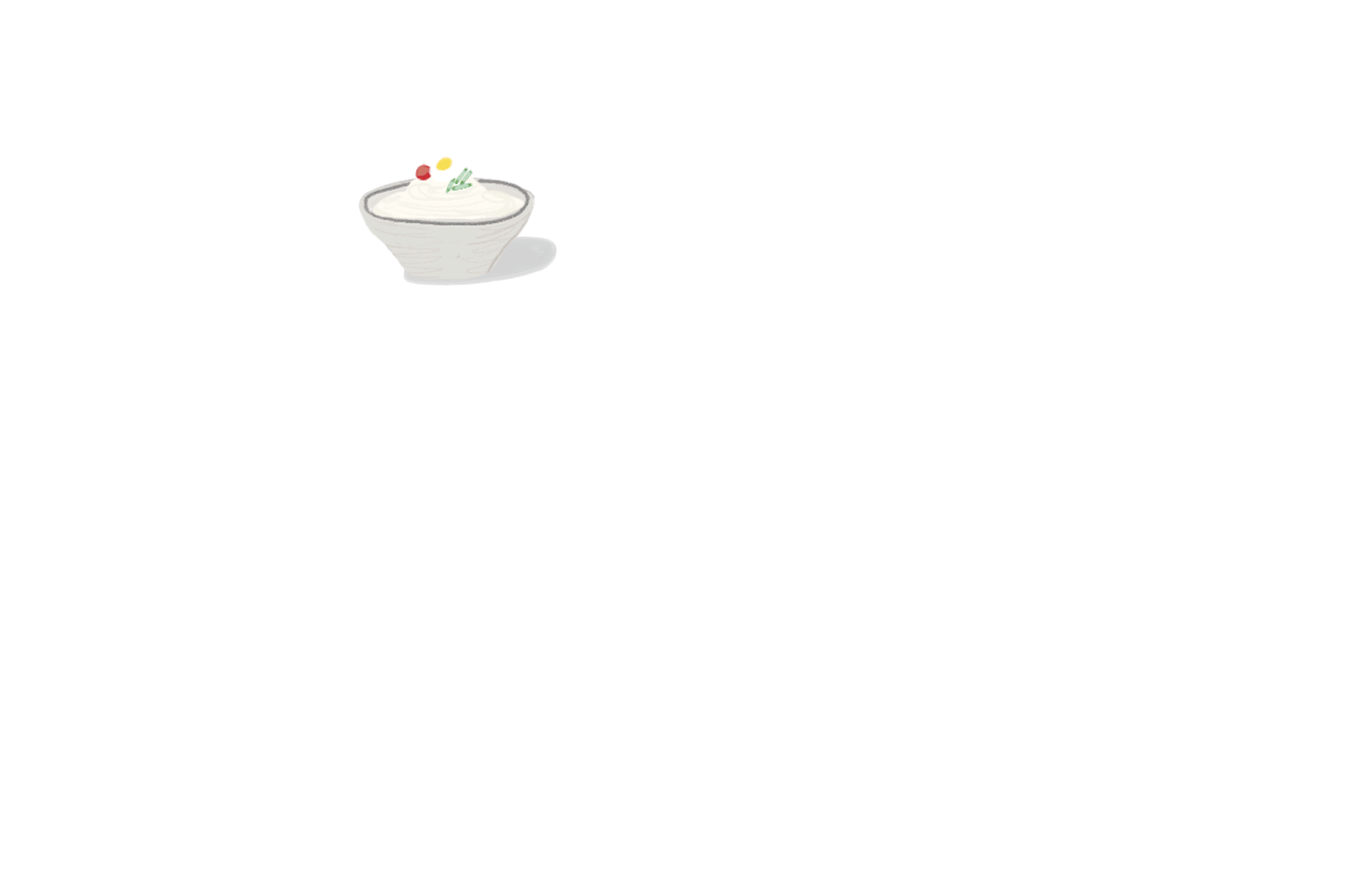
These are some of the illustrations of ingredients and Korean dishes that were initially made for the Dimi bang cookbook.